Creating a Paper World

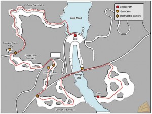
shadowcomplex_earlymapdesign_logoAnother excellent article I just want to quickly point out to you guys: It’s a short piece by the MTV Multiplayer blog about the design process behind the Shadow Complex world.

It basically boils down to the Chair Entertainment guys prototyping the entire game world on paper and playing through it. Accoding to the article this method helped identify and prevent at least a few issues that might otherwise have ended up in the final game. That just goes to show that there’s a lot of trouble you can avoid if you building a good prototype.

Creating a Living World

There’s a new video (one of hundreds) for Dragon Age: Origins out. Compared to the Marilyn Manson gore & tits fests of the other trailers this one is actually worth a look. Granted it’s still primarily a piece of promotional video but they touch on a few interesting points. A little bit about the visual design and the workflow.

They even bring up a few ideas I have lined up for yet another article about game spaces. And no, it’s not the one about boss fights…

Anyway, enough bla bla, here’s the video:

TF2 Map Progress

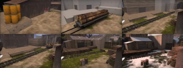
Over on the official Team Fortress 2 blog the guys from valve have just released some behind the scenes info on their mapping process for the new KotH Viaduct map. They’ve also been so nice as to include some time-lapse videos of the different map stages. This is a nice view at their work process. I have to admit though that the entire article is not very deep but nice to look at instead.

I say give it a look here: This point ain’t gonna cap itself!
tf2_viaduct-process

What struck me as odd in the videos was that the map was textured almost from the beginning. I would have enjoyed seeing some early footage in a raw, temporary textured state where they were still blocking out the basic shape – if they had such a stage. It might well be that they have enough experience with the game to be able to plan a map well on paper.

Regardless I certainly like the mention of valve doing playtests of the gamemode in modified, existing maps first to get a feeling for it’s dynamics. And I like the fact that they’ve set themselves a specific goal for the map: “we wanted a game mode that had an intense, centralized experience with quick player turnaround”. After playing the map for a while I certainly agree that they’ve suceeded at that.

There’s one thing I’m missing though: There’s no real side-route to get behind enemy lines. This is fine since it forces all action into the central spot as was the goal but I feel it hampers a few classes, especially the Pyro and the Spy. Still it’s a nice map and some nice videos I wanted to point you guys to.
Duke Nukem Forever Design Docs

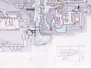
With the death of 3d Realms a wealth of Duke Nukem Forever information has been leaked to the world wide web. There’s been screenshots and a demo reel showing some real gameplay and now there’s design documents. Specifically some Level Design documentation and since I’m always interested in the way other people work and plan, this is a good luck.

Duke Nukem Forever Level Floorplan
On IGN you can find a document covering three levels of the game and there’s also a reveal of the plot overview document. I’m not entirely sure this is genuine but since I haven’t yet had a good look it’s hard to say. It certainly looks that way to the IGN folks.

Thanks to Kim for the tip and the links.

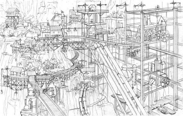
Damnation: Concept Level Design

Being a regular and avid Kotaku reader, I just stumbled over a small article and video from the developers of the game Damnation. This shooter tries to set itself apart by focusing on strong vertical elements in the gameplay. The video you can find here on Kotaku explains their approach to level design which is different enough to be remarkable. Update: there’s a HD version of the video available on Gametrailers.

Damnation Concept Artwork

The “usual” approach (if there is such a thing) of Shooter 3d Level Design is to come up with a floorplan of the level. Then concepts of important areas, which might have existed before or are created after the floorplan, are integrated. For example the secret temple at the heart of the map will be placed in a wide open area at the focus point of the level. The advantages of this are that the Level Designers can clearly plan the gameflow but obviously this has a few drawbacks. For example it might result in environments that do not fit together as well visually as they could. I also believe that this approach might be responsible for the prevalence of Room/Corridor/Room Levels.

The workflow chosen by the Damnation Developers Blue Omega begins with a large scale concept of the level, which is then used by the level designers to plan the player’s possible paths. This propably requires a close cooperation between the Concept Art and Level Design departments. An advantage I can see though is that the levels might end up looking much more organic, since they were planned as a “visual whole” instead of as a sequence of events/areas.

While I wasn’t too keen on Damnation, this video made me curious to take a closer look at the levels to see the fruits of this technique. It certainly sounds like an interesting idea but I’m sure that it’s not a perfect new solutions. Like everything it’s a method that has it’s uses for certain games . But it’s another tool to put in your Level Designer Toolbelt.