GDC2010: Day 2

Sorry for the delay but while I was able to write up the review for the first day of GDC at 4 o’ clock in the morning due to the jetlag, the rest of the days and nights I was way too busy to find the time to do so. However I still want to post the rest of the days but I’ll do so incrementally. That means I’ll start the post for one day, writing up one session, and then adding to that over time until everything is written.

That said, let’s start.

Level Design in a Day: Best Practices from the Best in the Business
Tuesday I decided to check out this full day tutorial. I was expecting a hands-on experience but because the attendance was so massive it was more of a lecture. Actually a couple lectures, each one on a different topic and held by a different Level Designer.

Level Design in a Day: Pre-Production
In this segment Ed Byrne of Zipper Interactive detailed the level design pre-production workflow as it exists at Zipper. It basically boils down to:

  • Level Brainstorming
    A session where the team openly brainstorms for interesting locations and environments
  • Abstracts
  • Encounter Ideas
    A brainstorming for ideas for high points in maps
  • Cell Diagram
    Arranging encounters into a sequence and context
  • Encounter Models
    Prototyping of encounters, not neccessarily within the engine
  • Walkthrough
    Writing a detailed walkthrough of the player experience
  • Paper Design
    Creating a detailed design of the individual levels

There was some discussion on this process among the panel, especially on the last part of Paper Design. A few designers mentioned that they stopped doing 2d paper designs and instead work directly within the engine, whiteboxing the level. The argument against 2d layout plans was that the dimension of height is often underused if a level is planned on a flat piece of paper.

Someone from the audience also made a good suggestion for an alternate Paper Design tool: Google Sketchup and/or Layout. While I haven’t really worked much with either program, I’ve heard good things and might give them a spin sometime.

Level Design in a Day: Core Space Creation
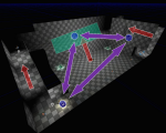
The second lecture was from Matthias Worch of Visceral Games. He talked about “Digital Ditch Digging”, the meat and potatoes of Level Design. Using Bioshock as an example, he talked about how the experience of the player is shaped by the “physical properties” and “ecology” of a level.

With physical properties Matthias means the walls and boundaries of the environment while ecology refers to the placement of items, pickups and other resources. These two elements combined can create “weighted spaces”, making certain locations more desireable or frequented, creating hotspots and choke points.

Something I really liked was his example of the simple UDK level done with only 10 brushes, 2 wepaons and 1 powerup. This seems like a great exercise for students to learn how to do the most with little detail. All you can do using these tools I whitebox your level.

The slides for this part of the presentation are available online in ZIP format.

Level Design in a Day: Rapid Prototyping using BSP
This section was from Jim Brown of Epic Games. In it he talked a lot about the Unreal Editor as a tool to quickly create levels. Most of it felt like an ad for the tool but there were some nice points, like the fact that the Gears of War team used Kismet (UED scripting language) to even prototype some enemies or items before they were then created in full.

The Anatomy of a Social Gamer: Why Do They Come, Play and Pay?
So after a while I decided to head back to the Social Games Summit to check out this lecture. It sounded interesting on paper but unfortunately wasn’t. The setup was that Marianne Borenstein from playdom moderated the panel made up of average social-gaming joes and janes.

The session then consisted of Marianne asking questions to her guests about their personal history and involvement with games of all kind. The idea was to use this to represent the Social Gaming audience and shed some light on their motives and expectations.

Unfortunately the panel was quite boring and I couldn’t really agree with the basic idea. 4 people are not able to accurately represent the breath of the social gaming audience, regardless of the method used to pick them.

Level Design in a Day: Narrative Support throgh Level Design
This was the last part of the tutorial that I have notes for. Held by Joel Burgess of Bethesda Softworks, it dealt with the way a level designer can actually tell a story. This was one of the high points of the tutorial with a lot of good thoughts and info.

He started off by talking about the tool of a storyteller, which he separated into two categories: Language and Visual information. The former is direct and unambiguous but brings with it the fact that it’s often tiresome and can be a lot of work to localize. Visual storytelling suffers less from these drawbacks but at a cost.

The idea is to use visual means to create patterns that the player can use to draw conclusions. The idea is that the player looks at the world and makes up his own stories based on what he sees. The stories created this way are very powerful, because the player has created them, he’s become a designer himself.

Joel had a few examples taken from Fallout 3 that emphasized his points. As said, I did enjoy the presentation and you can take a look at Slides in PPTX format yourself.

GDC2010: Day 1

So, the official part of Day 1 is over. I’ve spent most of the day listening to the various lectures of the Social and Online Games Summit. Roughly half of them have been very good and interesting, the other half was so-so.

Indies and Publishers: Fixing a System That Never Worked
I actually spent the first 20 minutes or so in this Indie Games Summit lecture. Ron Carmel of 2d Boy (World of Goo) was speaking and since I was so fascinated of his opening talk last year, I decided to give this one a try.

Unfortunately the talk didn’t do anything for me. Ron simply presented the traditional publishing model and contrasted it with indie development. Then to fix the problems of Indie Development (lack of funding) he presented the recently announced Indie Fund.

While I love the idea and concept of the Indie Fund, the lecture just seemed like an ad for the fund, which was a sort of turn off for me. I got up and left during the Q&A session.

How Friends Change Everything
I then went over to this keynote lecture by Gareth Davis of Facebook who talked about the platform and it’s relevance for gaming. Even though I missed the first half of it I still enjoyed it. Unfortunately I have made no notes but I’m sure it’ll be well covered by the blogosphere. Either way, the lecture was interesting, even if far from groundbreaking. Still nice to get a look behind the scenes at the monolith that is Facebook.

What Virtual Worlds Can Learn From Social Games
Next up was this lecture. The first one actually held by designer: Sulka Haro of Sulake, the makers of Habbo Hotel.

There were some interesting tidbits there, such as using the six different playstyles as defined by Mildred Parten to look at Social Games. This makes it clear that Social Games as we currently know them are mostly about the parallel play. People can’t really play with each other, instead they play “next to each other”.

Another thing was that the speed and responsiveness of an application can have a tremendous impact on retention and conversion rates. Habbo started out as a Shockwave plugin that was eventually moved to Flash for the much larger install base (98% vs 40%). This also sped up the performance of the app and led to +7% retention rate and +5% user conversion. Somewhat surprising that this has such an impact.

Sulka also talked about the advantages of the Facebook platform. An obvious one that nevertheless never crossed my mind is that there is no risk to lose users to forgotten user/pass data. How often do you just create an account out of impulse and then you forget which login data you used? Propably happens more often to your potential users than you’d think.

The last thing I want to point out was a little bit about the “placeness” of social games: In many games it doesn’t seem to be necessary. FarmVille has a game space but it’s not really used by the game. All that happens is the avatar walking around – and even that is best prevented by the players. There isn’t really a lot of justification to have such a game space. I kinda liked that statement because I am pretty much of the same opinion.

Why Are Gaming Veterans Flocking To Social Gaming
This roundtable was moderated by Noah Falstein (The Inspiracy) with Brian Reynolds, Brenda Brathwaite and Steve Meretzky speaking.

The four were talking on the topic and it was interesting to listen to them talk. All of them were attracted to the Social Game space by shorter development cycles, smaller teams and a sort of “pioneer spirit” as I’d call it.

Aside from that it was a great panel but not really something where I took a lot of notes. The only point I did write down was the argument about complexity: Will Social Games become more complex?

What was interesting about the answers was that there was a solid 50/50 divide. Two interesting arguments in this old debate that I want to repeat were: To keep gamers interested the game has to produce new content, sometimes in the form of new game mechanics. This layering will undoubtedly make games more complex. The other side of this is that the more complex these games get, the harder it is for them to lure new players in since there’s too much stuff to know and handle.

What Social Games Can Learn From Virtual Worlds
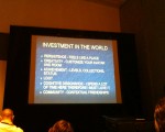
This lecture was held by Michael Goslin of Hangout Industries and definitely one of my favorites of the day. The talk was focused on the two key things that VWs/MMOs do better than Social Games: User retention and monetization.

According to Michael, retention is based on the following factors:

  • Player investment in the world
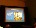
  • Deep content
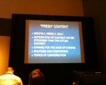
  • Fresh content
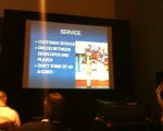
  • Service
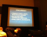
  • Concurrency (People playing simultaneously)
  • Community

He then elaborated on these points. I don’t have notes on this but I’ve taken pictures of each of these slides. I hope most of it is self explanatory:

Succeeding with Licensed Brands in MMOs and Virtual Worlds
This was the last talk of the day. Another roundtable, this time led by N’Gai Croal. Four licensors/licensees talked about their experiences with developing a licensed game.

The panel was alright, although a little generic at times. The key ideas though were: The approval process of the Licensor is generally in contrast with the need for constant, timely updates to keep the game fresh.

MMOs are services and monetized over a longer period of time. To have paying users, you need to retain them, which requires a quality experience. This is often at odds with the fixed deadlines as they are common in IP-based game development: Movie Games need to be finished and released by the time the movie hits the theaters.

So that was it for my first day. I’ll hopefully tell you all more tomorrow.

Flash Game: Continuity

After the end of year hiatus I’ve finally managed to write another post. And it’s another one of those I wanted to write for a while. It’s about a little Flash gamea called Continuity. I originally played it and planned to write sometime in December and just stumbled over it again via Twitter. So now it’s time for that short article but as with my article on Small Worlds you should give the Game a try first.

Continuity

So if you’ve played it then it should be obvious why I wanted to point that game out. It’s an excellent example of combining two games into an awesome new thing. Here the boring old tile puzzle was crossbred with the jump and run. The result is a game where the obstacle is not only to reach the exit by running and jumping but also by shifting the space around.

At it’s core the game is incredibly strong as it uses two well known game mechanics together. Most people have played such a tile game and many gamers have had contact with platformers. It’s quickly understood and has a lot of potential. I especially like how the game space poses two different challenges: One as an obstacle that has to be overcome by jumping and running, and one as a puzzle that has to be solved in the correct order.

Unfortunately the game suffers some in the execution. The graphics are very simplistic but not in a charming manner. The pacing is a bit too slow – the game takes too long before the levels start to get really interesting and more complicated. And the Jump and Run part isn’t really well designed – it’s lacking challenge and is mostly very easy or simple. Addmittedly, I didn’t finish it but I thought there was room for moving platforms, crumbling floors and other staples of the genre.

Either way, it’s still a game worth playing for it’s concepts.

Anno Wii (Dawn of Discovery) on Metacritic

I’ve posted about Anno: Create a New World (aka Dawn of Discovery in the US) before. I’ve done Level Design and Scripting on both the Wii and DS platforms. With the impending US release the amount of reviews on the Metacritic page is slowly increasing.

Anno Score on Metacritic

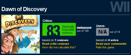
With enough reviews now, the game has currently got a Metacritic rating of 83. Which ranks Anno as 28th of all Wii games on Metacritic (out of 421). Not bad, if I may say so.

Anno Wii (Dawn of Discovery) Reviews

The game that has been my first, roughly one year long job at Keen Games was doing Level Design and Scripting for Anno: Create a New World (known as Dawn of Discovery in the US) for both Wii and DS. The game’s been out in Europe for a few days now and it’s to be released in the United States in late June.

Anno: Create a New World

Now there’s a couple of reviews for the Wii version available online and the great thing is that the game has so far been rated 80% and above. That’s a good feeling. I’m especially proud of the many positive reactions I’ve read on the story campaign. I’ve been a big part of it’s design and I’ve almost enitrely scripted this thing. With all that said, here are the reviews so far:

I’ll of course update this list as soon as I learn of more articles.

GDC09: Day 5, Review

The last day focused primarily on Level Design for me. Unfortunately too many interesting lectures were again on the same time slots so I was forced to pick and choose.

Everything I Learned About Level Design I Learned from Disneyland
The first lecture was translating the experiences of the Disney Imagineers, the creators of Disneyland, to the discipline of Level Design. It was held by Scrott Rogers. The slides to this lecture are available on his blog here.

While the talk was entertaining I unfortunately didn’t get too much from it since I was already familiar with many of the mentioned techniques. Maybe from the other articles on using Theme Parks as Level Design inspiration, such as the book the Art of Game Design (See day 2 for more info) from Jesse Schell or the following three Gamsutra articles from Don Carson: Article 1, article 2 & article 3 (Thanks to Tinkergirl for providing the handy links at her blog post on the same subject).

Anyway, with all that said, let’s just get into the lecture itself and what I think might be interesting for you:

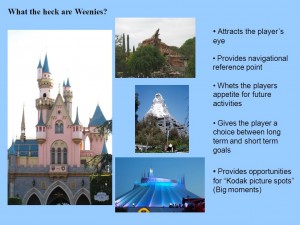
  • Weenies – Large visual eye catchers visible from far away (Castle at the center of Disneyland for example), that subtly attract the players attention, create navigational queues and great views to the player. They can be enhanced by making the surrounding terrain “focus” on the weenie. A simple way to test the effectiveness of your weenie is the squint test: Squint and the area that is the most obvious one (color contrast, brightness…) is the one that people are instinctively drawn to.
  • What are Weenies?

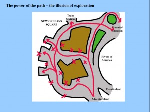
  • Exploring Paths – Even “linear” paths can convey an illusion of freedom and exploration by adding certain obstructions. Scott has a few diagrams in his slides that explain this in more detail. Important is that if the player spends time exploring, there should be a reward.
  • The Power of Paths - the Illusion of Exploration

Beyond Balancing: Using Five Elements of Failure Design to Enhance Player Experiences
This interesting take on game design was present by Jesper Juul who’s written quite a few books and articles on the subject of games. In this short lecture he took a look at how and why failures are important for design. Interesting for me was his distinction between Casual Gamers and the Hardcore. The former don’t like to fail while the latter do not mind to, since they want a challenge. When they fail their previous mode of play failed and so they need to adapt to overcome, something they enjoy.

Jesper further elaborated on how to properly design failure. He focused on the fact that bad failure is one that costs the player too much while good failure punishes just enough. He laid out the 5 costs of failure that a designer should be aware of when designing the failure mechanisms in his game:

  • Failure Count: How often does the player fail?
  • Failure Awareness: Is the player aware of the possibility of failure, even if unlikely?
  • Failure Communication: How is failure communicated?
  • Failure Setback: What is the cost of failure to the player?
  • Failure Repetition: Do you have to repeat the game after a failure or is the experience a different one (random content)?

Using these five questions failure should be designed to fit into player’s lives.

Aarf! Arf Arf Arf: Talking to the Player with Barks
Patrick Redding from the Far Cry 2 design team at Ubisoft Montreal held this 30 minute talk on the use of random audio snippets of actors to enhance the game experience. The talk was quite technical at times but interesting to listen to. The primary takeway for me was:

The functions of “Barks” are:

  • Bring the game world to live
  • Make the AI seem smarter than it actually is
  • Communicate their status and “thoughts” to the player
  • Support the themes of the game

UI Art Production from the Ground Up
The description of this talk from David Rose, Lead UI Artist for Neversoft sounded intriguing. Shortly after start I chose to leave the presentation though. Not for the subject matter but for the way it was presented: Unfortunately David chose to simply read out loud the text written on his slides, something that is too dull for me to pay much attention to. So instead I left and went to see another lecture:

Learning from the Atari 2600
Coming late to Ian Bogost‘s talk on the Atari 2600 and it’s technologically based game design was worth it. – more later.

Art Directing Horror and Immersion in DEAD SPACE
Ian Milham – more later.

The Iterative Level Design Process of Bioware’s MASS EFFECT 2
Corey Andruko & Dusty Everman – more later.

GDC09: Day 4, Review

GDC Microtalks – One Hour, Ten Speakers, Unlimited Ideas
The first session of Thursday were the Microtalks, each one being 6 minutes from one speaker talking about some aspect of games. Unfortunately I got up a bit too late and missed the first half. I only saw Robin Hunicke, Eric Zimmerman, Clint Hocking, Jenova Chen, Frank Lantz and Jane McGonigal.

Regardless I have to say though that this was one of the best lectures at GDC. The talks were all very interesting and refreshing, each one handling a different topic. In short:

Robin Hunicke said that home sucks because it’s no fun. Players are searching for their on fun, like trying to stand on benches. She had a couple of play-like suggestions for features to add to increase the fun: For example a graffiti-like system.

Eric Zimmerman was more of an action than a talk. What we did was play a game where normally useless scraps of colored paper suddenly became meaning as groups of the audience tried to form up.

Clint Hocking ranted about the problems with the 100% rating system and opted for a simpler, less inflationary 5 star system.

Jenova Chen was talking about the possibility of different kinds of “fun”. Like the early cinema games offer “primal” experiences. Film has moved beyond that with a wide variety of genres. What is in store for games and how can social play evolve beyond chat lines?

Frank Lantz argued that games are not a medium as we often say, since they were present before the advent of digital computing and will be around afterwards.

Jane McGonigal, the last and in my opinion best, speaker was talking about “kindness to strangers”. How behaving like this makes us feel good. The internet tends to have a bad kindness ratio since people are very anonymous. Left 4 Dead on the other hand has very kind players who help one another.

From COUNTER-STRIKE to LEFT 4 DEAD: Creating Replayable Cooperative Experiences
Held by Valve‘s Michael Booth it dealt with the thoughts behind the design of Left 4 Dead. Their initial thoughts were the lack of co-op games, which is both a risk and an opportunity. Togeter with Valve’s skill at creating epic singleplayer (half-life) and compelling multiplayer (counter-strike) experiences this would provide an opportunity to merge these together to create a multiplayer game with singleplayer feel.

Everything in the design had to follow the fact that cooperation was to be essential. This strong focus can be considered one of the strenghts of L4D and it’s responsible for things such as a lack of classes or the small number of weapons.

GDC L4D lecture

As a L4D player I also enjoyed the look at the pacing algorithms of the AI Director and how to create anticipation and suspense. Also the reasons for why the special infected were designed the way they are in the game were very interesting.

Helping Your Players Feel Smart: Puzzles as User Interface
Randy Smith of the recently founded Tiger Style Games was holding this lecture on the design of puzzles. The puzzles he concentrated on are those that are spatially present in video games, such as Tomb Raider. Considering those as “normal” User Interfaces and viewing them as such was at the core of this lecture. One of Randy’s chief inspirations seemed to be an interface design book called The Design of Everyday Things, which looked really interesting.

Basically the mentioned principles boil down to the following:

  • Visibility – Make sure your Puzzle Objects are recognizable
  • Affordances – Make sure the intended interactions of your Puzzle Objects are intuitively understood
  • Visual Language – Be consistent in your visual language of your Objects.
  • Mapping – Ensure that the player can visually or conceptually link the different Objects.
  • Conceptual Modelling – The player understands the inner workings of the puzzle and which action does what.

All in all the lecture was interesting but I didn’t feel that it brought me much new information. I believe that it could be held in half the time and still work just as well. An important tidbit though was the comment from another member of the audience: She(?) mentioned Cognitive Walkthroughs, a “usability inspection method”, as a sort of method to analyze your Puzzles.

Have You Got Perfect Pitch?
A panel of industry veterans giving a view on the pitching process from the other side of the table: Lee Jacobson (Midway), Michael Denny (Sony Europe), Sebastien Motte (Microsoft) and Dan Winters (Activision) all provided some helpful insight.

In general it seems to break down to the following points:

  • Don’t be boring (20 minutes max, know your audience, no backstory)
  • be passionate (send the right person, be excited about your project)
  • Have a good project (2-3 important points, intriguing)
  • Have a good team (previous projects, experience)

What was surprising to me besides these (somewhat obvious points) was that pitching a project is not done to the decision makers but rather to a subset of the company. These guys have then to promote it within the company to make sure it gets through. For this reason it’s good to build your pitch so that it gives them something to work with when trying to convince the decision makers.