A coworker of mine just pointed me to a little flash game called Small Worlds. I’ve started playing it and I immediately fell in love. Now normally I put all the playworthy flash games I find up over at the everyplay blog but Small Worlds was special enough in the way it treats game space that I wanted to mention it here. Before you read on, take some time and play it. It’s worth it.
The game was created by David Shute and is subtitled “A short atmospheric game about exploring“. It was entered in the Casual Game Design Competition #6 and won it as well. In it you take control of a simplistic avatar and move around to explore the world around you and find “the exit”. Sounds like most of the games out there, right?
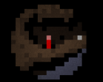
What sets Small Worlds apart is that the entirety of the explored space always fills the screen. This means that in the beginning all you have are a few big colorful pixels, maybe some of them moving, and a soundtrack. At first it’s impossible to make out where or what you are. Then as you play with the keys you notice that the red pixels make up your avatar. As you move around and discover more of your immediate surroundings the picture becomes slightly clearer. Moving white pixels turn to snow as your understanding of the space shifts.
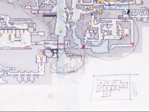
This is part of what makes Small World excel at it’s premise of exploration: As you explore you can feel the gears in your head turn as you understand more and more of the space. Then, after this happens, the game still doesn’t loose it’s magic. My guess is because of the immediate feedback: Seeing all of the discovered space on screen shows you which areas you haven’t uncovered yet. It gives you the feeling that even if you explore dead ends, you haven’t wasted your time, because instead you’ve gotten more of the big picture. In that vein it’s a bit like a scratchcard to me.
![]() The Avatar Machine is an interesting art project by Marc Owens. He tries to represent the aesthetics and viewpoint common in 3rd person MMOs. Certainly worth checking out his video of the device in action.
The Avatar Machine is an interesting art project by Marc Owens. He tries to represent the aesthetics and viewpoint common in 3rd person MMOs. Certainly worth checking out his video of the device in action.
