Vancouver Game Design Expo 2010

A guest post from Olaf Schroth on the Vancouver Game Design Expo:

On April 10 and 11 2010 the fourth annual Game Design Expo 2010 took place in Vancouver. The event was hosted by the Vancouver Film School (VFS) which has a strong course program in gaming and features speakers including Armando Troisi, Lead Cinematic Designer on BioWare’s runaway hit Mass Effect 2, who discussed the game’s approach to interactive narrative, and United Front Games’ William Ho, who explored user-generated content through the lens of the highly-anticipated PS3 title ModNation Racer.

Other speakers included creative movers from the legendary California-based developer Obsidian Entertainment (Alpha Protocol), Blue Castle Games (Dead Rising 2), Propaganda Games (Tron: Evolution), and Big Sandwich Games (Sky Pirates of Neo Terra). The day ended with an industry panel hosted by Electric Playground’s Victor Lucas called “The Future of Gaming.” For this blog, I would like to report about two of the presentations, first about Armando Troisi and in a second post, about a fascinating approach to designing architectural spaces for Dead Rising 2.

Troisi: Bioware Roleplaying Games (RPG) – It`s all about choice
According to Troisi, the four Bioware Design Pillars are Story, Exploration, Progression and Game Play and through the course of every game, the player will cycle through these four elements multiple times. Thus, story always comes first for Bioware and Troisi focused on the Bioware way of storytelling.

The “how of interactive narrative”: It is all about choice and how game designers add interactivity into narrative space. That is what makes games as a medium different from movies. In the following, Troisi picked three key design elements that Bioware developed to tell a modern roleplaying game story.

Mass Effect 1 and 2 are “objective” rather than classic “subjective” RPGs
Troisi and his team broke with some holy RPG rules – they replaced the “Subjective”, i.e. the player IS the avatar, through the “Objective”. You are not the avatar anymore, but Sheppard has his own motivation and the player becomes a voyeur watching Sheppard acting on his own. I only remember a Pen&Paper Round where I as a GM started playing somebody`s character, telling how he reacts and that player got really upset. However, Troisi still kept “The Agreement” in order not to completely upset players.

The agreement means, the player should still have the choices he wants and Sheppard`s actions should be predictable with regard to the players’ choice. Troisi showed a scene that didn`t make it in the final version, where the player decided that Sheppard should bargain with a trader and instead, he completely screwed him. Which was funny but not part of the player agreement.

The Bioware “Dialogue Wheel” is an element of interface design to control an “objective” character
An important design element of the GUI is the “Dialogue Wheel” which was so successful that Bioware used it in (the subjective) Dragon Age as well. The player has always the same six choices in the same location so that he intuitively knows which reaction Sheppard will take although the player cannot choose Sheppard`s exact words like in a classic subjective RPG.


Continuing the Mass Effect story across three games: It`s the little differences

An important requirement for ME2 was that it was designed to continue the players` decisions from ME1. 100 pieces of information were taken over, impacting 700 plot hooks (!) in ME2 and many of them were really small and simple. And the best – your story will continue in ME3!

For example, Troisi showed how some ads are changing depending on whether you rescued the Citadel council in ME1 or not. According to Troisi, they put a lot of effort into such small things that maybe 2% of all players will ever see – but these few feel really rewarded. Interestingly, later presenters opposed the Bioware approach and emphasized that they want all players to see everything.

Quick-time events as a way to give the player a choice without interrupting the story
Finally, Troisi justified the so-called “Quick-Time Events” or “interrupts” (reminds me of MtG) they invented for ME2 as an instrument to give the player a choice without disrupting an intense scene. Interestingly, ME2 never gives you both paragon and renegade choices, because “doing nothing” is always an alternative choice as well.

User tests had shown that players were already overstrained with three choices under this time pressure. Like the verbal paraphrase, the quicktime scenes include visual paraphrases, e.g. Sheppard loosening his knuckles in combination with a renegade option means he will get very physical soon…

See part 2 of my Game Design Expo post for a look into the spatial architecture (not information architecture) of Dead Rising 2. Where Fosters and Co. could learn from the Undead…

Related links

Miegakure

Miegakure is a four-dimensional puzzle platformer. And when I say four dimensional, I don’t mean to use the 4th to refer to time or something equally lame. No, another actual spacial dimension. As far as I can tell the in-development game is played in three dimensions and at the push of a button one of the dimensions can be exchanged with another one. An intriguing concept and worth to watch for the mindbending spaces it is bound to create.

I won’t pretend to know how this is supposed to work but it certainly is interesting. Here’s a video that might help

GDC2010: Day 2

Sorry for the delay but while I was able to write up the review for the first day of GDC at 4 o’ clock in the morning due to the jetlag, the rest of the days and nights I was way too busy to find the time to do so. However I still want to post the rest of the days but I’ll do so incrementally. That means I’ll start the post for one day, writing up one session, and then adding to that over time until everything is written.

That said, let’s start.

Level Design in a Day: Best Practices from the Best in the Business
Tuesday I decided to check out this full day tutorial. I was expecting a hands-on experience but because the attendance was so massive it was more of a lecture. Actually a couple lectures, each one on a different topic and held by a different Level Designer.

Level Design in a Day: Pre-Production
In this segment Ed Byrne of Zipper Interactive detailed the level design pre-production workflow as it exists at Zipper. It basically boils down to:

  • Level Brainstorming
    A session where the team openly brainstorms for interesting locations and environments
  • Abstracts
  • Encounter Ideas
    A brainstorming for ideas for high points in maps
  • Cell Diagram
    Arranging encounters into a sequence and context
  • Encounter Models
    Prototyping of encounters, not neccessarily within the engine
  • Walkthrough
    Writing a detailed walkthrough of the player experience
  • Paper Design
    Creating a detailed design of the individual levels

There was some discussion on this process among the panel, especially on the last part of Paper Design. A few designers mentioned that they stopped doing 2d paper designs and instead work directly within the engine, whiteboxing the level. The argument against 2d layout plans was that the dimension of height is often underused if a level is planned on a flat piece of paper.

Someone from the audience also made a good suggestion for an alternate Paper Design tool: Google Sketchup and/or Layout. While I haven’t really worked much with either program, I’ve heard good things and might give them a spin sometime.

Level Design in a Day: Core Space Creation
The second lecture was from Matthias Worch of Visceral Games. He talked about “Digital Ditch Digging”, the meat and potatoes of Level Design. Using Bioshock as an example, he talked about how the experience of the player is shaped by the “physical properties” and “ecology” of a level.

With physical properties Matthias means the walls and boundaries of the environment while ecology refers to the placement of items, pickups and other resources. These two elements combined can create “weighted spaces”, making certain locations more desireable or frequented, creating hotspots and choke points.

Something I really liked was his example of the simple UDK level done with only 10 brushes, 2 wepaons and 1 powerup. This seems like a great exercise for students to learn how to do the most with little detail. All you can do using these tools I whitebox your level.

The slides for this part of the presentation are available online in ZIP format.

Level Design in a Day: Rapid Prototyping using BSP
This section was from Jim Brown of Epic Games. In it he talked a lot about the Unreal Editor as a tool to quickly create levels. Most of it felt like an ad for the tool but there were some nice points, like the fact that the Gears of War team used Kismet (UED scripting language) to even prototype some enemies or items before they were then created in full.

The Anatomy of a Social Gamer: Why Do They Come, Play and Pay?
So after a while I decided to head back to the Social Games Summit to check out this lecture. It sounded interesting on paper but unfortunately wasn’t. The setup was that Marianne Borenstein from playdom moderated the panel made up of average social-gaming joes and janes.

The session then consisted of Marianne asking questions to her guests about their personal history and involvement with games of all kind. The idea was to use this to represent the Social Gaming audience and shed some light on their motives and expectations.

Unfortunately the panel was quite boring and I couldn’t really agree with the basic idea. 4 people are not able to accurately represent the breath of the social gaming audience, regardless of the method used to pick them.

Level Design in a Day: Narrative Support throgh Level Design
This was the last part of the tutorial that I have notes for. Held by Joel Burgess of Bethesda Softworks, it dealt with the way a level designer can actually tell a story. This was one of the high points of the tutorial with a lot of good thoughts and info.

He started off by talking about the tool of a storyteller, which he separated into two categories: Language and Visual information. The former is direct and unambiguous but brings with it the fact that it’s often tiresome and can be a lot of work to localize. Visual storytelling suffers less from these drawbacks but at a cost.

The idea is to use visual means to create patterns that the player can use to draw conclusions. The idea is that the player looks at the world and makes up his own stories based on what he sees. The stories created this way are very powerful, because the player has created them, he’s become a designer himself.

Joel had a few examples taken from Fallout 3 that emphasized his points. As said, I did enjoy the presentation and you can take a look at Slides in PPTX format yourself.

GDC2010: Day 1

So, the official part of Day 1 is over. I’ve spent most of the day listening to the various lectures of the Social and Online Games Summit. Roughly half of them have been very good and interesting, the other half was so-so.

Indies and Publishers: Fixing a System That Never Worked
I actually spent the first 20 minutes or so in this Indie Games Summit lecture. Ron Carmel of 2d Boy (World of Goo) was speaking and since I was so fascinated of his opening talk last year, I decided to give this one a try.

Unfortunately the talk didn’t do anything for me. Ron simply presented the traditional publishing model and contrasted it with indie development. Then to fix the problems of Indie Development (lack of funding) he presented the recently announced Indie Fund.

While I love the idea and concept of the Indie Fund, the lecture just seemed like an ad for the fund, which was a sort of turn off for me. I got up and left during the Q&A session.

How Friends Change Everything
I then went over to this keynote lecture by Gareth Davis of Facebook who talked about the platform and it’s relevance for gaming. Even though I missed the first half of it I still enjoyed it. Unfortunately I have made no notes but I’m sure it’ll be well covered by the blogosphere. Either way, the lecture was interesting, even if far from groundbreaking. Still nice to get a look behind the scenes at the monolith that is Facebook.

What Virtual Worlds Can Learn From Social Games
Next up was this lecture. The first one actually held by designer: Sulka Haro of Sulake, the makers of Habbo Hotel.

There were some interesting tidbits there, such as using the six different playstyles as defined by Mildred Parten to look at Social Games. This makes it clear that Social Games as we currently know them are mostly about the parallel play. People can’t really play with each other, instead they play “next to each other”.

Another thing was that the speed and responsiveness of an application can have a tremendous impact on retention and conversion rates. Habbo started out as a Shockwave plugin that was eventually moved to Flash for the much larger install base (98% vs 40%). This also sped up the performance of the app and led to +7% retention rate and +5% user conversion. Somewhat surprising that this has such an impact.

Sulka also talked about the advantages of the Facebook platform. An obvious one that nevertheless never crossed my mind is that there is no risk to lose users to forgotten user/pass data. How often do you just create an account out of impulse and then you forget which login data you used? Propably happens more often to your potential users than you’d think.

The last thing I want to point out was a little bit about the “placeness” of social games: In many games it doesn’t seem to be necessary. FarmVille has a game space but it’s not really used by the game. All that happens is the avatar walking around – and even that is best prevented by the players. There isn’t really a lot of justification to have such a game space. I kinda liked that statement because I am pretty much of the same opinion.

Why Are Gaming Veterans Flocking To Social Gaming
This roundtable was moderated by Noah Falstein (The Inspiracy) with Brian Reynolds, Brenda Brathwaite and Steve Meretzky speaking.

The four were talking on the topic and it was interesting to listen to them talk. All of them were attracted to the Social Game space by shorter development cycles, smaller teams and a sort of “pioneer spirit” as I’d call it.

Aside from that it was a great panel but not really something where I took a lot of notes. The only point I did write down was the argument about complexity: Will Social Games become more complex?

What was interesting about the answers was that there was a solid 50/50 divide. Two interesting arguments in this old debate that I want to repeat were: To keep gamers interested the game has to produce new content, sometimes in the form of new game mechanics. This layering will undoubtedly make games more complex. The other side of this is that the more complex these games get, the harder it is for them to lure new players in since there’s too much stuff to know and handle.

What Social Games Can Learn From Virtual Worlds
This lecture was held by Michael Goslin of Hangout Industries and definitely one of my favorites of the day. The talk was focused on the two key things that VWs/MMOs do better than Social Games: User retention and monetization.

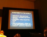
According to Michael, retention is based on the following factors:

  • Player investment in the world
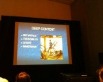
  • Deep content
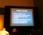
  • Fresh content
  • Service
  • Concurrency (People playing simultaneously)
  • Community

He then elaborated on these points. I don’t have notes on this but I’ve taken pictures of each of these slides. I hope most of it is self explanatory:

Succeeding with Licensed Brands in MMOs and Virtual Worlds
This was the last talk of the day. Another roundtable, this time led by N’Gai Croal. Four licensors/licensees talked about their experiences with developing a licensed game.

The panel was alright, although a little generic at times. The key ideas though were: The approval process of the Licensor is generally in contrast with the need for constant, timely updates to keep the game fresh.

MMOs are services and monetized over a longer period of time. To have paying users, you need to retain them, which requires a quality experience. This is often at odds with the fixed deadlines as they are common in IP-based game development: Movie Games need to be finished and released by the time the movie hits the theaters.

So that was it for my first day. I’ll hopefully tell you all more tomorrow.

Gearing up for GDC

Alright, I’m gearing up for this year’s GDC, which means two things for this blog.

The first thing is that, just as last year, I’m planning to update this blog with daily information on lectures from the conference. I’m not sure I can do this on time since I’ll be quite busy but I will eventually put up at least a short review of every single session I attend. For one thing because I want to for myself and then again because it’s kinda my job. I’ve been promoted to Team Lead Game Design here at Gameforge recently and with power comes responsibility or something. In short I have to hold a presentation on the GDC for my left behind co-workers (which I will be happy to do). So that said look forward to some writeups soon.

And while I’m on the topic of the GDC: If you’re attending and for one reason or another want to meet up feel free to get in touch with me, which shouldn’t be that hard. If possible I’ll also try to post my schedule ahead of time but I’ll have to figure that thing out first. There’s just too much good stuff to see.

The second thing is that this means GameArch is now officially one year old. It’s a good reason to take a look back at the past year: I’ve started this blog as a place for me to talk about and share my passion about games with the internet as a whole. My plan was to write about game spaces and occasionally do bigger articles that provide some value to the developer community as a whole. I’ve started out with the GDC reviews and eventually wrote a lot of smaller articles. I used to mirror most of the bigger posts over at my Persional Gamasutra Blog. I got some good feedback and discussions started over there which eventually motivated me to submit a big article to the site. Titled No More Wrong Turns (blog link, gamasutra link) it originally started as a post for this blog but outgrew it in scope. I’m still pretty happy with that article as I feel it was the one article that best fulfilled my initial vision. Admittedly after that activity on the blog kinda dropped off with only a few smaller articles now and again.

I’m hoping to get a little bit more impetus into this project though. Don’t expect any miracles but I’ve still got a couple of post ideas written up that I’m itching to write. And from those I’ve got one already as good as finished: My previously mentioned article on Boss Mob Design. Granted it’s again veering a bit off the game spaces idea but I believe it’s an interesting article and can be helpful for fellow designers. Because of it’s size though it might again end up at Gamasutra first. Let’s see how that goes.

Flash Game: Continuity

After the end of year hiatus I’ve finally managed to write another post. And it’s another one of those I wanted to write for a while. It’s about a little Flash gamea called Continuity. I originally played it and planned to write sometime in December and just stumbled over it again via Twitter. So now it’s time for that short article but as with my article on Small Worlds you should give the Game a try first.

Continuity

So if you’ve played it then it should be obvious why I wanted to point that game out. It’s an excellent example of combining two games into an awesome new thing. Here the boring old tile puzzle was crossbred with the jump and run. The result is a game where the obstacle is not only to reach the exit by running and jumping but also by shifting the space around.

At it’s core the game is incredibly strong as it uses two well known game mechanics together. Most people have played such a tile game and many gamers have had contact with platformers. It’s quickly understood and has a lot of potential. I especially like how the game space poses two different challenges: One as an obstacle that has to be overcome by jumping and running, and one as a puzzle that has to be solved in the correct order.

Unfortunately the game suffers some in the execution. The graphics are very simplistic but not in a charming manner. The pacing is a bit too slow – the game takes too long before the levels start to get really interesting and more complicated. And the Jump and Run part isn’t really well designed – it’s lacking challenge and is mostly very easy or simple. Addmittedly, I didn’t finish it but I thought there was room for moving platforms, crumbling floors and other staples of the genre.

Either way, it’s still a game worth playing for it’s concepts.