Immersion vs. Flow?

I’ve just watched a lecture from Clint Hocking (thanks for the link, Beren) about the changing demographics and generations and their impact on the Game Design Industry, as developers, critics and of course audience shift. Clint takes a long time to build up to his important points but it shows an interesting perspective on the different trends of game design and well worth the hour it runs. It again features Clint’s rapid-fire style I’ve already seen at the GDC microtalks. Since I recommend it. why don’t you check it out right now?

IGDA-Montreal – Feb 09: Clint Hocking – The Next Generation Player

(Slides are available from Clint’s Website)

However while I enjoyed the lecture, I want to write about an aspect only partially related to the talk. At the very end of it Clint presents what he perecives to be one (of two) critical questions of Game Design: Immersion. The problem he says is that Generation X games focus on full-time, single-player immersion (something he exhaustively explored with Far Cry 2), while Generation Y games would propably have to shift the immersion model to accomodate a more multiplayer oriented, bite-size immersion. This made some of my brain cells fire.

Taking a look at the Generation X immersion, it seems to me that it’s aspriring to emulate the story-focused immersion model as is used by movies. In the cinema you sit down to experience a linear, uninterrupted experience. Sicne this is a passive media it makes it easy to just absorb and become immersed. Afterwards you mingle with the other moviegoers and discuss what you personally took away from the experience. The Generation X immersion focused, story heavy, single-player games tried to do the same. They create a nonstop reality to engage in and once you’re over you can discuss you personal experience with other players, arguing about different viewpoints and interpretations. This seems to be a somewhat flawed approach, because contrary to the movie experience, games are not a passive medium.

The difference is that the player can directly act and change the outcome of the game. There is this abstract layer of game elements that’s between the player and the game world, which regularly forces the player’s mindset into a different space than that of the story. This is propably because there are two forces at work:

There is the story based immersion into the narrative, plot and setting.
And there is flow, the immersion into the game mechanics.

While I’m not sure where I’m going with this, I found this to be an interesting observation. It’s clear that there are games that focus only on one of these feelings. For example many of the games from thatgamecompany such as the eponymous flOw or flOwer focus on the sensual immersion into the flow of the game’s rules, the moment to moment interaction. Other games try to focus more on the narrative immersion, trying to hide the game elements as much as possible. This however seems to be somewhat of a futile effort. Regardless of how much you hide the interactive elements, the player still has direct contact with them, since they are his interface. This is propably the reason why flow-only games (Tetris, Lumines, Peggle) without a detailed narrative pull in the player much deeper than games focusing much more on the immersion. There propably is a good middle ground here, where your game flow is intriguing and in sync with your narrative immersion.

Damnation: Concept Level Design

Being a regular and avid Kotaku reader, I just stumbled over a small article and video from the developers of the game Damnation. This shooter tries to set itself apart by focusing on strong vertical elements in the gameplay. The video you can find here on Kotaku explains their approach to level design which is different enough to be remarkable. Update: there’s a HD version of the video available on Gametrailers.

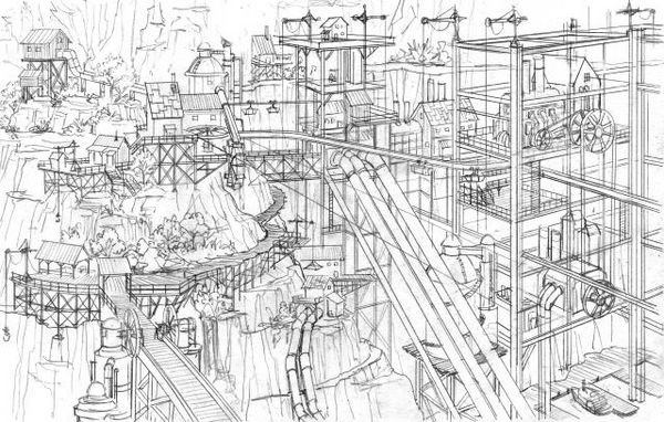
Damnation Concept Artwork

The “usual” approach (if there is such a thing) of Shooter 3d Level Design is to come up with a floorplan of the level. Then concepts of important areas, which might have existed before or are created after the floorplan, are integrated. For example the secret temple at the heart of the map will be placed in a wide open area at the focus point of the level. The advantages of this are that the Level Designers can clearly plan the gameflow but obviously this has a few drawbacks. For example it might result in environments that do not fit together as well visually as they could. I also believe that this approach might be responsible for the prevalence of Room/Corridor/Room Levels.

The workflow chosen by the Damnation Developers Blue Omega begins with a large scale concept of the level, which is then used by the level designers to plan the player’s possible paths. This propably requires a close cooperation between the Concept Art and Level Design departments. An advantage I can see though is that the levels might end up looking much more organic, since they were planned as a “visual whole” instead of as a sequence of events/areas.

While I wasn’t too keen on Damnation, this video made me curious to take a closer look at the levels to see the fruits of this technique. It certainly sounds like an interesting idea but I’m sure that it’s not a perfect new solutions. Like everything it’s a method that has it’s uses for certain games . But it’s another tool to put in your Level Designer Toolbelt.

Tactical Architecture at Calpoly

More than a month ago, when it was clear that I was coming to California for a few weeks I got back into touch with a few people from here to see whom I could meet. Among these people was Tom Fowler IV, a professor for Architecture at Calpoly, with whom I was working during my stay there in 05/06.

He asked me if I wanted to hold a lecture about Architecture and Level Design. Of course I jumped at the opportunity and started to think about possible topics. Since most students were from the Architecture department and had little to no previous experience to making games I decided to just go over the very basics, explaining what game and level design is and what it’s goals are.

The lecture went well even though I was finished a bit too early and should have prepared some more in depth material. I was glad to see that there was lots of interest though since the (small) room was pretty much filled. I’m guessing 40 to 50 people.

Anyway, since the subject I spoke on is an interesting one I thought I’d like to try and write up a proper article for this blog sometime after I get back to Germany…

GDC09: Day 5, Review

The last day focused primarily on Level Design for me. Unfortunately too many interesting lectures were again on the same time slots so I was forced to pick and choose.

Everything I Learned About Level Design I Learned from Disneyland
The first lecture was translating the experiences of the Disney Imagineers, the creators of Disneyland, to the discipline of Level Design. It was held by Scrott Rogers. The slides to this lecture are available on his blog here.

While the talk was entertaining I unfortunately didn’t get too much from it since I was already familiar with many of the mentioned techniques. Maybe from the other articles on using Theme Parks as Level Design inspiration, such as the book the Art of Game Design (See day 2 for more info) from Jesse Schell or the following three Gamsutra articles from Don Carson: Article 1, article 2 & article 3 (Thanks to Tinkergirl for providing the handy links at her blog post on the same subject).

Anyway, with all that said, let’s just get into the lecture itself and what I think might be interesting for you:

  • Weenies – Large visual eye catchers visible from far away (Castle at the center of Disneyland for example), that subtly attract the players attention, create navigational queues and great views to the player. They can be enhanced by making the surrounding terrain “focus” on the weenie. A simple way to test the effectiveness of your weenie is the squint test: Squint and the area that is the most obvious one (color contrast, brightness…) is the one that people are instinctively drawn to.
  • What are Weenies?

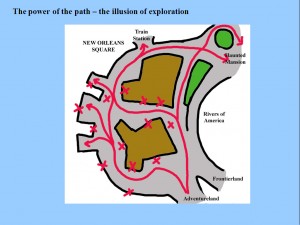
  • Exploring Paths – Even “linear” paths can convey an illusion of freedom and exploration by adding certain obstructions. Scott has a few diagrams in his slides that explain this in more detail. Important is that if the player spends time exploring, there should be a reward.
  • The Power of Paths - the Illusion of Exploration

Beyond Balancing: Using Five Elements of Failure Design to Enhance Player Experiences
This interesting take on game design was present by Jesper Juul who’s written quite a few books and articles on the subject of games. In this short lecture he took a look at how and why failures are important for design. Interesting for me was his distinction between Casual Gamers and the Hardcore. The former don’t like to fail while the latter do not mind to, since they want a challenge. When they fail their previous mode of play failed and so they need to adapt to overcome, something they enjoy.

Jesper further elaborated on how to properly design failure. He focused on the fact that bad failure is one that costs the player too much while good failure punishes just enough. He laid out the 5 costs of failure that a designer should be aware of when designing the failure mechanisms in his game:

  • Failure Count: How often does the player fail?
  • Failure Awareness: Is the player aware of the possibility of failure, even if unlikely?
  • Failure Communication: How is failure communicated?
  • Failure Setback: What is the cost of failure to the player?
  • Failure Repetition: Do you have to repeat the game after a failure or is the experience a different one (random content)?

Using these five questions failure should be designed to fit into player’s lives.

Aarf! Arf Arf Arf: Talking to the Player with Barks
Patrick Redding from the Far Cry 2 design team at Ubisoft Montreal held this 30 minute talk on the use of random audio snippets of actors to enhance the game experience. The talk was quite technical at times but interesting to listen to. The primary takeway for me was:

The functions of “Barks” are:

  • Bring the game world to live
  • Make the AI seem smarter than it actually is
  • Communicate their status and “thoughts” to the player
  • Support the themes of the game

UI Art Production from the Ground Up
The description of this talk from David Rose, Lead UI Artist for Neversoft sounded intriguing. Shortly after start I chose to leave the presentation though. Not for the subject matter but for the way it was presented: Unfortunately David chose to simply read out loud the text written on his slides, something that is too dull for me to pay much attention to. So instead I left and went to see another lecture:

Learning from the Atari 2600
Coming late to Ian Bogost‘s talk on the Atari 2600 and it’s technologically based game design was worth it. – more later.

Art Directing Horror and Immersion in DEAD SPACE
Ian Milham – more later.

The Iterative Level Design Process of Bioware’s MASS EFFECT 2
Corey Andruko & Dusty Everman – more later.

GDC09: Day 4, Review

GDC Microtalks – One Hour, Ten Speakers, Unlimited Ideas
The first session of Thursday were the Microtalks, each one being 6 minutes from one speaker talking about some aspect of games. Unfortunately I got up a bit too late and missed the first half. I only saw Robin Hunicke, Eric Zimmerman, Clint Hocking, Jenova Chen, Frank Lantz and Jane McGonigal.

Regardless I have to say though that this was one of the best lectures at GDC. The talks were all very interesting and refreshing, each one handling a different topic. In short:

Robin Hunicke said that home sucks because it’s no fun. Players are searching for their on fun, like trying to stand on benches. She had a couple of play-like suggestions for features to add to increase the fun: For example a graffiti-like system.

Eric Zimmerman was more of an action than a talk. What we did was play a game where normally useless scraps of colored paper suddenly became meaning as groups of the audience tried to form up.

Clint Hocking ranted about the problems with the 100% rating system and opted for a simpler, less inflationary 5 star system.

Jenova Chen was talking about the possibility of different kinds of “fun”. Like the early cinema games offer “primal” experiences. Film has moved beyond that with a wide variety of genres. What is in store for games and how can social play evolve beyond chat lines?

Frank Lantz argued that games are not a medium as we often say, since they were present before the advent of digital computing and will be around afterwards.

Jane McGonigal, the last and in my opinion best, speaker was talking about “kindness to strangers”. How behaving like this makes us feel good. The internet tends to have a bad kindness ratio since people are very anonymous. Left 4 Dead on the other hand has very kind players who help one another.

From COUNTER-STRIKE to LEFT 4 DEAD: Creating Replayable Cooperative Experiences
Held by Valve‘s Michael Booth it dealt with the thoughts behind the design of Left 4 Dead. Their initial thoughts were the lack of co-op games, which is both a risk and an opportunity. Togeter with Valve’s skill at creating epic singleplayer (half-life) and compelling multiplayer (counter-strike) experiences this would provide an opportunity to merge these together to create a multiplayer game with singleplayer feel.

Everything in the design had to follow the fact that cooperation was to be essential. This strong focus can be considered one of the strenghts of L4D and it’s responsible for things such as a lack of classes or the small number of weapons.

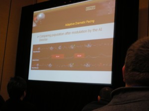
GDC L4D lecture

As a L4D player I also enjoyed the look at the pacing algorithms of the AI Director and how to create anticipation and suspense. Also the reasons for why the special infected were designed the way they are in the game were very interesting.

Helping Your Players Feel Smart: Puzzles as User Interface
Randy Smith of the recently founded Tiger Style Games was holding this lecture on the design of puzzles. The puzzles he concentrated on are those that are spatially present in video games, such as Tomb Raider. Considering those as “normal” User Interfaces and viewing them as such was at the core of this lecture. One of Randy’s chief inspirations seemed to be an interface design book called The Design of Everyday Things, which looked really interesting.

Basically the mentioned principles boil down to the following:

  • Visibility – Make sure your Puzzle Objects are recognizable
  • Affordances – Make sure the intended interactions of your Puzzle Objects are intuitively understood
  • Visual Language – Be consistent in your visual language of your Objects.
  • Mapping – Ensure that the player can visually or conceptually link the different Objects.
  • Conceptual Modelling – The player understands the inner workings of the puzzle and which action does what.

All in all the lecture was interesting but I didn’t feel that it brought me much new information. I believe that it could be held in half the time and still work just as well. An important tidbit though was the comment from another member of the audience: She(?) mentioned Cognitive Walkthroughs, a “usability inspection method”, as a sort of method to analyze your Puzzles.

Have You Got Perfect Pitch?
A panel of industry veterans giving a view on the pitching process from the other side of the table: Lee Jacobson (Midway), Michael Denny (Sony Europe), Sebastien Motte (Microsoft) and Dan Winters (Activision) all provided some helpful insight.

In general it seems to break down to the following points:

  • Don’t be boring (20 minutes max, know your audience, no backstory)
  • be passionate (send the right person, be excited about your project)
  • Have a good project (2-3 important points, intriguing)
  • Have a good team (previous projects, experience)

What was surprising to me besides these (somewhat obvious points) was that pitching a project is not done to the decision makers but rather to a subset of the company. These guys have then to promote it within the company to make sure it gets through. For this reason it’s good to build your pitch so that it gives them something to work with when trying to convince the decision makers.

GDC09: Day 3, Review

With the Summits over after Tuesday it was now time for the regular conference. The noteable differences were: More people, no unified theme for the sessions and just plain less time for lectures.

Indies SIG
My first stop of the day was attending the Indies SIG roundtable. To elaborate: the Indies SIG (Special Interest Group) is a small, informal group of people within the IGDA (International Game Developers Association – gotta love dem Acronyms). This was basically a meeting trying to figure out what the IGDA in general and the SIG in particular can do to be of more benefit to it’s members. Since membership in the IGDA costs (~50 USD a year) the association has gotten some flak lately from it’s members that it does not really do anything substantial.

The roundtable was very poorly attended though. We were maybe a dozen people but there were some good ideas. Best (IMHO) among those some were sort of event calendar (Indie awards, Game jams) and a mentor program. Let’s see what comes of this.

Building Your Airplane While Flying: Production at Bungie
Because I forgot my SD card I couldn’t really make any pictures but for Wednesday I borrowed Kevin’s (the friend I’m staying with) SD card and made a few photographs.

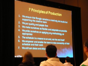
Here’s one from this lecture:
Bungie Lecture 4

The talk itself was about the improvements Bungie made in it’s production organization after the mess that was Halo 2 without losing the studio culture. Allen Murray outlined the methods used to get there: One was increasing the number production staff (11+ Producers for 150+ Developers). Of course this alone is not a solution so there are a few other things in place, for example: There is a non-negotiable polish phase planned. This can not be removed under any circumstances and is (IIRC) 2 weeks per person. Also the producers at Bungie do not design, that is they do not take design decisions. They also worked to make their scheduling more transparent by providing a HTML output to everyone. Team members are constantly updated on their own schedule but can also look into everyone elses planning.

The talk was very informative and I did like that Allen mentioned the importance of physical architecture on the design team. The Bungie offices have been redesigned into a more open space where teams can be easily formed by moving people around.

Balancing Multiplayer Competitive Games
David Sirlin held this lecture on the design of MP competetive games. Being a professional Street Fighter player for many years the talk was undoubtedly colored by David’s experiences with the game.

Nevertheless David made a few very nice arguments and he does get big bonus points for his nice handout. What I liked was the point that local imbalance (RTS example: not all same-tier units are the same) and global imbalance (RTS example: one race is better than the other one) are different and that local imbalance is a good thing, while global imbalance is not. He also mentioned a tier system he uses for development which sounded quite like a handy tool.

The most important thing though was what he called self-balancing forces. These are mechanics that are so designed as to make exploits harder or impossible. The example he gave from Guilty Gear (fighting game) was a mechanic to avoid juggling the opponent in the air with a constant flurry of punches. All the game does is increase gravity after every punch, eventually making it so high that the attacker does not have time for a further attack. That’s just god damn clever and yet so simple!

Germans unite
And that was the last session. I spent the rest of the day at the Expo, talking to the Germans I met. That is the Games Academy Booth and the boys and girl from Brightside Games who were at the GDC for the IGF nomination of their student game Zeit². I was also briefly at the German evening, organized by the Messe Koeln but left early.

GDC German Evening