Alright my dear readers, the Gamsutra embargo for No More Wrong Turns is up so it’s time to post the article on this blog. In here I’m going to talk about navigation through the spaces of video games and the different tools that help us with that. This is mostly going to be relevant for 3d environments but much can be applied to 2d graphics as well. Also please bear with me, this is going to get quite long.
With the ever increasing complexity of our games and our game spaces, the need for some support has increased just as well. The earliest games often consisted of only one screen. All the action of the game was immediately visible at a glance. Think of Space Invaders or Pac Man. There are no hidden corners, no secret objectives. Nothing. These games are games of (almost) perfect information: You can see all there is to the game. All pieces are on the board, so to speak.
Nowadays it’s a lot different. The ability to display the entirety of the game world on one screen was quickly abandoned in favor of larger environments. Be this through scrolling or through leaving one screen and entering the next. The step to immersive, open worlds in 3d has just emphasized this even more. And that’s before we add the increasing complexity of the gameplay on top of it. Don’t fret it though, there’s help.
Discrete Navigational Tools
First off I’ve separated the navigational tools into two big categories: Discrete and immersed. We’ll start off with discrete navigation tools first. And by discrete I mean that the tools are separate from the environment. They’re a part of the Graphical User Interface and not the game environment. This puts them into squarely into the realm of Game Design. It also makes them stand out – that means they are noticeable but can also be obnoxious. However the fact that they’re abstract makes it easy to use them to easily transmit more than just spatial information (a position, line, area or volume). For example the color of a dot on the map might display its health or whether it’s friend or foe. Speaking of maps, let’s start with the first tool:
The Map
The map is what most of you probably thought of when I wrote navigational tool. It is the most obvious method and the most unsubtle one. What a map does is it displays the environment in an abstract and usually simplified way to provide a good overview over the game space. To that end, it often also contains other information on the game state such as the position and state of units or objects in the spaces. This makes maps very helpful for games in which the spaces are sprawling and complex and/or where there’s a lot of different information to manage.
For example in Colossal Cave Adventure, the first adventure game, the player uses text to navigate through a cave maze. The game features no map, since it’s all text, but it is so complex that it practically forces the player to sketch one as he plays.
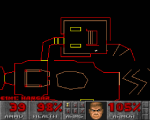 We’ve learned since then and the general trend to user-friendliness has ever increased over the past 30+ years. A step on that road was Doom. For the first time there were complex and immersive 3d environments navigated from a free first person perspective. And since this was not only new to the players but also to the developers, there was little in terms of immersed navigational tools. So to not get lost, players needed a map. And to spare the player the task of drawing it, the game takes over by drawing the Automap for him: As the player progresses more and more of the game world becomes visible in his map. This type of map is quite common as it adds to the sense of discovery of the game and shows the players those areas that he hasn’t explored yet.
Also noteworthy is that unlike many games, the map in Doom isn’t static. Often times, you can activate the map, take a look at the world, and then return to the game to continue playing. In Doom you can bring up the map by pressing the Tab key. In this new view you can move around using the normal controls. The map moves accordingly while the arrow symbolizing your avatar turns. The controls are a bit awkward and objects or characters (except the player’s avatar) are not displayed. Still you can give the map a try in this Flash Version of Doom.
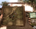 Another more recent example of a map is Far Cry 2. In this game’s huge open world Africa, the map is necessary to find your targets. What sets it apart from other games is the way the map is integrated into the game. It’s not an overlay (as in Diablo) nor is it a separate screen as in Doom. Instead your character brings up a map in his hands without you leaving the game and breaking immersion. And just as with Doom it allows you to look at your map and still move through the world. It’s also worth noting that unlike Doom the large Far Cry 2 map does not need to be uncovered. A map of the entire gaming space is available from the beginning.
A point of note: the danger of maps that are fully uncovered is that the player might not know where he’s been already. In such cases it’s often useful to show the entire map but display unvisited areas differently to give hints as to which places to check out if the player is stuck. Instead of such a feature Ultima Underworld: The Stygian Abyss provided the players with the ability to add comments to the map. This could often be used to mark areas that were already investigated and explored.
In games where discovery is important, uncovering areas of the map can be fulfilling. The player first has to find out about the environment, and sometimes finding pieces of the map can even be a reward in itself. For example in Metroid Prime 3: Corruption the levels are peppered with secret rooms. In this game the player can unlock all the rooms of the current level on his map which makes it a lot easier to find these rooms. Here the map becomes part of the reward system. A negative point of note about this map though is that it is in 3d which makes it a bit hard to use. It’s still quite good compared to other attempts at 3d mapping though. For example the map in Tom Clancy’s Splinter Cell: Chaos Theory is in 3d and anything but easy to use. Using 3d makes it much harder to quickly understand the complex space which partially defeats the purpose of the thing in the first place.
Of course video games can also create impossible spaces that are very difficult to map in a way that is easily understood: Corridors that return the player to the starting position, even though they are a straight line, or doors that lead the player to different places each time they’re opened. In these cases a map is usually not much of a help, especially as they are often meant to confuse the player.
The Marker
The next type of tool is what I dubbed Markers: A Marker highlights a certain position or area in the world through a discrete interface element. Kind of like a Augmented Virtual Reality. Note that this element can be a 2d graphic or 3d model. Also some markers are also only visible when the associated object or place is visible while others can be seen even through walls and other obstacles.
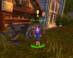 Markers are very useful to lead the player to a certain position in the world – even if it is in motion. Because of they are often used to identify important areas of interest, like the positions of teammates or enemies to make it easy to reinforce, engage or evade. Or they draw attention to objectives or other places of potential interaction. For example the exclamation mark icons over the quest givers in World of Warcraft are what I would call a Marker. They make it easy for the player to navigate to important places where he can interact with the game.
Another example of Markers would be Left 4 Dead, where icons are used to highlight critical resources (ammo, weapons or “peels”) and places of interaction (crescendo moment triggers). L4D also highlights the locations of your fellow teammates with a halo around their forms with the color displaying their current state. And last but not least, when a teammate can be brought back into action, a silhouette shows where the team has to go to free him or her.
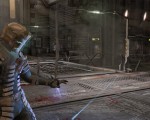 Another well done use of this can be found in Unreal Tournament 3. Here players new to a team based multiplayer map can activate animated help arrows which show the way to the enemy flag. This is a good way to quickly teach new players the maps. This idea of marking the path rather than the target is also used in the help system of other games such as Army of Two and Dead Space.
A slightly odd example for a Marker are the red objects in Mirror’s Edge. These change color to highlight the obstacles the player can interact with. This is straddling the line between immersed and discrete tools since we’re talking about objects that are a part of the world. However since these change color as the player approaches, they are definitely interface and not a part of the world itself.
Apart from those examples I also want to highlight (pun not intended) another games’ use of Markers: Anno: Create a New World (or Dawn of Discovery) for Wii and DS. In Anno the game sometimes places position and/or area markers to point to certain positions. This is used to show the player where to build his first house or where to steer his ship in order to advance the story. However the top-down view in Anno can only display markers when they’re on the screen. If you don’t look at the place you have to steer your ship to then you won’t see the marker which doesn’t help you if the player has to find the spot in the first place. And that’s where the next discrete tool comes in.
The Compass
Unlike the Marker which marks a certain spot, the Compass is part of the interface and points towards a place in the environment. Trying to explain it differently: When you move, the Marker stays with the world while the Compass moves with you. The Marker displays the target’s absolute position while the Compass shows it’s position relative to you.
Continuing the example of Anno from above, the Compass is a big arrow which points to the currently active (point or area) Marker. This arrow however is only visible when the original Marker is not on the screen. As the player approaches the Marker, the Compass arrow fades out. This isn’t the only instance where Marker and Compass are closely intertwined. Quite a few games use a Marker for important objects. However when these objects are very important you want the player to be aware of their existence and location, even when they aren’t on the screen. Which is where the Compass comes in.
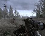 A quite classical example of a Compass would be Call of Duty 4: Modern Warfare. It features a pretty simplistic compass which displays the cardinal points as well as the direction towards the next objective. The compass changes as the player turns so if the objective lies in the center then it’s straight ahead of the player.
Another Compass only system is the teammate locator in Gears of War. Here if a teammate goes down a circle pops up on the players HUD. The circle shows in which direction the wounded buddy is, relative to the player’s position (plus some other assorted information).
Yet another Compass only, although more indirect, is the Jewel Detector of Far Cry 2. This gadget doesn’t use a direct arrow to point to the hidden jewel suitcases. Instead it features a green light that starts to flash when the player gets close to one of these cases, increasing in frequency as the distance decreases. Additionally the light stays green if the player is looking directly at the position of these cases. This roundabout way of doing things helps make the search for jewel cases a lot more fun as you’ve actually have to go look for them and try to triangulate their position. Especially as the detector is not sensible to differences in altitude: I’ve found myself standing in an empty room wondering, while the jewel case sat on the roof. Also let me note that a lot of first person shooters use a Compass system to point a player under fire towards his attacker.
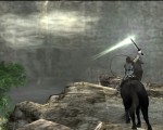 And finally the last example is another odd one: The sword beam from Shadow of the Colossus. It is also noteworthy because the game manages to include a helpful interface without breaking immersion and while reinforcing the exploration and discovery themes of the game.
Alright. That’s all the discrete tools and a lot of text but I’m afraid there’s even more. Let’s head over to the immersed navigation methods:
Immersed Navigation Tools
As mentioned before, immersed navigation tools are a part of the game environment. Unlike discrete tools which are general interfaces used throughout the game, immersed tools have specific applications in the individual environments. These tools also don’t stand out as much as discrete ones and generally aren’t perceived as a part of the interface. This is because they are built out of the Components (Geometry, Textures, Lights, Characters…) that are also used to build the environment itself, which makes them the responsibility of the level designer. It also means that most of them won’t be consciously used by the player. Instead they serve as subtle instruments by which to guide the player but with this unobtrusiveness comes the danger that some players may just overlook them.
The fact that they’re an immersed part of the level also makes them a lot harder to classify. Which is why I’m grouping them based on their purpose. I’ll explain each purpose and then give a few examples on how to achieve the desired effect with different components.
Attract

When using this tool, the aim is to attract the player’s attention to a certain location. This is often used in linear level designs with complicated rooms to make it clear where the player has to move to in order to continue. It can also be used in less linear levels to highlight important areas of interaction – maybe places that the player will revist often.
Essentially the idea behind this is to make this target area look more important and thus interesting to the player so that he moves closer. This can be done quite subtly so that the player is unconsciously pulled towards where you want him to be. Of course it can also be done using more blatant means which will most likely cause the player to respond more consciously. As you can imagine there’s quite a number of ways to go about this so I’ll try and list a couple examples below.
Contrast
If we want to attract the player, we first want to catch his eye. Here painting techniques help us a lot. After all painting has been manipulating and steering the human eye for millennia. So what’s true for paintings is true for levels: Visual contrast is a good method to catch a players’ eye. The higher the contrast, the more likely the area is to be noticed. For example light coming into a dark room from a doorway will attract the player’s eye and that makes him a lot more likely to approach the doorway.
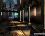 In general light works really well as a method to highlight (pardon the pun) areas and paths. There’s a reason that a lot of Disney theme park rides use light to mark their exits: So the visitors instinctively head toward the light and thus avoid congestions. Believe me, it works: While working on the PSP version of G-Force I had to run through a level to get to a certain point in the game to test something. To get there I had to go past a T-section in a vent shaft area. And even though I was familiar with the level I always took the wrong turn there. Why? Because I was playing without thinking consciously and that route was lighted better. And as soon as we had that changed I didn’t end up going the wrong way.
To further expand on how important this is, there’s also what’s called the “Squint test”: You squint and look at a screenshot of your game. The brightest area is where people’s eyes will most likely be drawn. There’s even a Squint mode feature in the Unreal Engine 3 Editor that blurs your viewport to simulate such a test.
Of course apart from light you can also use other methods to create a contrast: You could use a unique shape that stands out to attract the player’s attention. One arched doorway next to four rectangular ones will look a lot more important. You can also use color to create a contrast. A red door in an otherwise white room is going to catch the players’ eye much more than a grey one will.
Composition
 Similar to how the technique of contrast is informed from painting techniques, this method is too. Here objects in the environment subtly point towards where the player has to go. The lines of the objects are oriented so that if the eye follows them it will reach the intended target. This works especially well if these lines cross the intended boundaries directly. For example a plank lying over a chasm will give the player the hint that jumping over said chasm is the way to continue.
Weenies
A Weenie is a term taken from the Disney theme park designers. It refers to a large structure in the distance that’s clearly visible to the theme park visitor. What these weenies do is give reference points for navigation within the park as whole. Additionally they also look interesting and important so that the visitor wants to come closer and check them out. The same principle can be applied to Level Design.
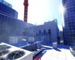 A good example of this in use is in the game Mirror’s Edge. Here the player learns that he has to follow the red objects to get to his goal. And in one map there’s a large red radio tower visible in the background. The shape is already unique as most other buildings are skyscrapers but add to this the color red which both stands out and already has some navigational meaning and this Weenie is sure to draw the player in.
Motion
Motion is an excellent way to attract attention. Based on how our human eyes and brain work, animation and movement easily catch someone’s eye. This increases the effectiveness of a visual component tenfold as compared to static clues. Whether it’s sparks, moving doors or flickering lights – they all work equally well. However using motion also means that player interest is a lot more conscious than with unmoving elements. This also includes scripted events such as a crane breaking down or a door being blasted off its hinges. These events will grab the players’ attention and surely make him want to investigate.
Cutscene
Short cutscenes can also be an excellent tool to focus a players’ attention on a certain area. For example when entering a big room, the camera shows the contents of the room and ends up focusing on the closed door at the other side. This clearly tells the player that this door is important and probably the way to leave this room. Of course this interrupts gameplay briefly but a cutscene can communicate complex routes quite clearly.
Characters
Adding Characters to a level can help the player navigate. For example in a shooter the player will be used to attacking his targets and then moving past them. If he’s suddenly being attacked from a balcony in a house then this will focus his attention on that area. Maybe he might wonder how to reach this position to get a better vantage point or to grab whatever items his enemies will drop. Whatever the case the player now knows that there’s something up there which makes him likely to investigate. Additionally if the game features some sort of hit-direction compass then the player also gets the direction of his attackers as a clue. This makes this work even if the player’s not looking at them directly when hit.
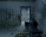 Another way to use Characters is to use friendly units to show the way. If your allies are moving along the planned path and through a doorway the player will take notice of that route and probably follow them along. Of course only if he notices them leave. For this reason it might make sense to have one character leave through the doorway and another one take up a position next to it. That way, even if the player misses the initial character leaving he can still spot the second one and come to the conclusion that the doorway is important. Be careful with this though as you don’t want to make the player feel like he’s only following his allies and not exploring himself. Also you of course need a robust AI that doesn’t get stuck or ends up in the wrong place.
Pickups
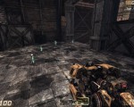 Just as with Characters, Pickups will draw the players’ attention. One reason is that pickups are most often highlighted to be clearly visible: Maybe they even rotate or pulsate. Either way they often stand out visually. Add to this the fact that most players will want to pick them up and you’ve got a perfect tool to attract players to a location or to pull them along a route. This can also be used well in multiplayer maps where there usually are lots of items around.
In G-Force we’ve used this technique to help the player find the way to continue. The environment of many levels requires the player to frequently ascend and descend however the camera cannot be used to look up or down in regular gameplay. Because of this the tops of shelves or tables might not immediately seem like the places to continue. However if he sees a pickup rotating on the table the player is much more likely to investigate. Also the rotating pickups made them visible even if they were at the sides of the screen.
Identify

This method is used to help the player with his ability to orient himself within the environment. It does so by distinguishing different areas from one another. This helps the player identify them and thus gives him a sense of position in the overall level. This only really makes sense in non-linear worlds such as hub-levels, multiplayer arenas or large open worlds.
Landmarks
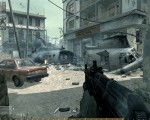 Landmarks are immediately visible features of the environment. While within the area the Landmark is often in view. This way it can give identity to a location. In smaller maps it could be a statue or maybe a large red truck. In bigger maps it could be a prominent bridge or a skyscraper. As you can imagine Landmarks and the Weenies mentioned above can be one and the same object to both attract the player to a location and help him identify it.
Style
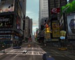 Unlike the Landmark, where there’s one dominating feature, using Style means that the difference permeates an entire area. It could be a different architectural style, indoor vs. outdoor or plainly and simply a different color through textures, light or post processing effects. I doesn’t matter as long as the different areas are distinct enough for the player to easily distinguish and remember. A downside is though that you still have to teach the player the relative position of the different locations. It’s not really evident to a player standing in a back alley that the little pirate village is right next to the dark woods.
Guide

The Guide method is building actual guides into the map itself. These guides clearly lead the player along to where he wants to be. This also makes them quite obvious since players need to consciously see and use them. Examples would be signs or colored lines throughout the level. In some cases there are even maps of the level displayed as textures on the wall.
Of course this kind of tool only really makes sense in non-linear environments where there are multiple different places of importance to reach. Especially if the places are complex or there’s lots of different ways to get from one to the other. In linear levels there’s little need for this.
Signs
Team Fortress 2 from Valve Corporation is an obvious example for Guide Signs: The game features complex multiplayer maps that sometimes even change during gameplay. To help the players learn and cope there’s a lot of signage throughout the levels. These signs are clearly visible and generally make it easy for the player to figure out which route to take to get to a certain area. They also fit in well with the visual style and theme without seeming out of place, even though they are clearly huge.
Lines
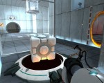 Portal, another Valve game, is a good Example of Lines. Even though the individual areas aren’t too big, the interplay of the different interactive elements can be complex at times. To help here the game visualizes logical connections, such as between a button and a door, by using glowing lines. These are a great help when navigating the environment. They also have the added bonus that they transmit a lot of other information as well, something that’s generally hard to do with immersed navigational tools: These lines also display the states of the different interactive objects (button pressed, energy on…) and their links (button A opens door B).
Lines are also used to great effect in the Apple Orchard Level of the horror game Condemned: Criminal Origins. Playing an FBI investigator the player has to use his equipment to follow clues such as blood trails. This is used throughout the game but since almost all the levels up to this point are linear it is of little importance. In this second to last map however the player is in an old farmhouse. Here he can freely explore the house but to make sense of it he has to use his special lamp to light up the four different trails of scrawled writing. Following each of them to their conclusion is required before the player can continue the game. This works really well as the player is unable to fight back while using the light and ends up easily distracted following the writing as it crawls up walls and continues along the ceiling.
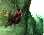 The 2008 Prince of Persia video game also makes great use of lines, albeit very subtle. In this game the player can do a wild manner of acrobatics such as walking along walls or climbing up columns. This variety of movements makes it harder to decide what to use when. To help with this the game features scratches and other damage to display the different paths. If there are scratches along a wall then that means that to continue the player has to perform a wall-run. This is a subtle method that works well with the setting but has the problem that once there are different routes the player isn’t sure which one to follow.
Conclusion
Okay. So that’s all the tools and methods I could think of. I hope that you’ve enjoyed the read and that it got your gears spinning. However, to give you something to really work with I want to close the article with some tips on when and how to best use the presented tools and methods.
The first step to using them is already done: Now that you’ve (hopefully) read the article and are now (probably) aware of their existence can begin to consciously use them to solve your design problems. This doesn’t mean that you’ll always have to throw so much information at your player that he feels like he has no other choice but to follow your instructions. An important part of all these tools is that they make it easier for the player to make meaningful decisions. They do not remove his ability to decide. Which is why methods, such as sealing off all doors after the player has passed through them to only allow him to move on are not listed above.
Also keep in mind that less is often more. In some instances it can be desirable to not give any navigation hints. For example the madness maze that can be found in Max Payne is such a case. Here the player is supposed to have a hard time finding the right path. All the walls look alike and so the player will wander around aimlessly. This can be annoying but since the area in the example is quite short it’s not so frustrating as to become a problem.
However if you decide to provide some help to the player, how do you go about it?
Below I’ll have a couple of notes and tips for you. There’s some repetition of important information mentioned above but there’s also some new points in there as well. I’ve chosen to use a bullet point format to make it easy to get an overview. So that said, let’s get started:
Discrete Navigation Tools
- Discrete Tools are the general rules of the game used in many environments
- They are a part of the game’s Graphical User Interface
- Discrete Tools are designed by the Game (or Interface) Designer
- They can communicate more information than just spacial data (position, line, area, volume)
- They can easily adapt to moving or changing targets
- Discrete tools are used consciously by the player
- Are often very obvious and hard to overlook
- The information displayed through them seems very important
- Discrete Tools can be optional, players can adjust or deactivate them
- Too much information and options can easily confuse the player
What are the properties of Maps and when and how do you use those?
Maps provide an abstract view of the game space as an overview
- They are best used in games with non-linear maps, complex spaces where tactical use is important or levels with lots of units
- Games where you want the player to focus on the game itself should not use maps
The right degree of abstraction is critical
- Simplify the display as much as possible while still making it easy for players to quickly understand where each place is
- 3D maps are often too complicated to use quickly and easily
Maps can be static (no interaction with the game itself) or interactive (allowing interaction, often while the game still runs)
- Static maps are good for games where you only want to communicate information since they are less complicated
- Complex games where there are lots of resources and units to manage do benefit from an interactive map
Maps can be a separate screen or an element of the regular game interface
- Separate screens provide you with more screen real estate to use for the map but this breaks the regular game flow
- If during your game the player often needs to sneak a quick glance at the map it’s better to display it embedded in the GUI
Maps can be a paused or live, that means being displayed and updated while the game runs
- A map on a separate screen hides the regular view and often needs to pause the game, especially if its static. This breaks game flow
- A live map doesn’t interrupt gameplay but in stressful situations it becomes difficult to both pay attention to the game and the map
Areas on the map must first be uncovered by visiting them. Alternatively the entire map is visible from the beginning
- If your game features a strong element of discovery then the uncovering of the map helps support this
- If the game is less about uncovering the map but rather about how to use the environment then it makes sense to make it all visible
Areas on the map can be uncovered as a bonus, maybe through collecting items or fulfilling side-quests
- Unlocking parts of the map can be a great bonus if this information grants the player an advantage such as showing a hidden route
- This can even be used with already fully unlocked maps by displaying previously secret information like a secret area with powerups
Maps can mark areas already visited by the player
- This is especially helpful for environments where the player has a lot of different routes that he can take and side paths he can uncover
- This is only really needed if the map is areas of the map are visible without the player having visited them, maybe because they were visible from the start or because they were unlocked as a bonus
What are the properties of Markers and when and how do you use those?
Markers highlight a target or target area by using a graphical interface element
- They are best used in games where the player needs to be aware of the precise location of different important targets and their states
- They make more sense in non-linear maps but can also be used in linear environments
Markers are visible in the regular game view, directly marking the target
- This makes it easy to understand what the marker refers to once the target area or object is visible
- When the target is not in view, the marker is also hidden forcing the player to look around. Here Markers can be well complimented by Compasses
They can be displayed only when the object is visible or all the time
- Marking the target only when it’s on screen makes it easy to understand what to do within the visible area but provides no navigational help otherwise. This makes sense for very localized interactivity that would otherwise not be entirely obvious
- Always showing a marker is useful for when the target is of relevance regardless of position
- Markers can also be shown/hidden based on the player’s distance to the target to achieve a compromise
They can easily communicate additional information about the target area
- Because of this markers are very useful to highlight targets of varying types and different states
Markers are “in the face” of the player which makes them look quite important
- This means that the players will make conscious use of Markers
- Too many elements however can distract the player or clutter the screen. Fading out Markers when they would obstruct (near the center of the screen perhaps) could help mitigate this.
What are the properties of Compasses and when and how do you use those?
Compasses point the player toward a target by means of the graphical user interface
- They are best used in games where the player needs to be aware of rough direction towards important targets
- They are mostly used in non-linear maps but can also be used in linear environments, especially if the target is in motion
Compasses only give a rough direction towards the target
- It can sometimes be difficult to understand what the Compass is pointing to, especially if the target area or object isn’t otherwise marked. Here Markers can be used to clarify
- This slightly unclear information can be an essential game element by making the player actively search for the target and explore the area
Compasses can communicate additional information about the target area
- Because of this markers are very useful to highlight targets of varying types and different states
Compasses can look quite important, especially if they’re in or near the center of the screen
- When they’re in the middle of the screen players are consciously aware of them
- Like with Markers, too much can clutter the screen. Fading out the Compass when not needed can help lessen the negative impact
So that’s all about the discrete tools, now on to the immersed methods, their properties and a few pointers on how to use them.
Immersed Navigation Tools
- Immersed Methods are different based on the specific application in a certain level
- They are a part of the environment
- They use elements of the Level Design toolkit and are the responsibility of the Level Designer
- Immersed Tools have a stronger effect when they are linked with gameplay elements
- Consequent use of gameplay related hints is necessary to work properly
- Small changes can often be enough to properly lead the player on but note that the amount and scale of hints is relative to the size of the space they are in
What are the properties of Attract Methods and when and how do you use those?
These methods are used to attract the player to a certain location to subtly steer him through the level
- Use these if your players always turn left and end up in a dead end while you want them to go right
- They are only really useful if there’s specific routes you want to highlight, regardless whether the level is linear or not
What are the properties of Identify Methods and when and how do you use those?
Identify methods are used to distinguish different areas so the player knows his relative position within the level
- Identify your areas if your players get lost in the level and don’t have a clue where they are
- These only really make sense if you have open levels where the player can freely navigate or if you’ve got a lot of back and forth movement
Awareness of the different areas still does not make the player understand their spatial relation.
- To help with this, the game can teach the space to the player so he will develop a mental model of the different areas
- Alternatively Maps and Guide can help as well. They are especially useful if they can easily be visually linked to the target (by style or color for example)
What are the properties of Guide Methods and when and how do you use those?
These methods are used to provide guides so the player can chose which way to go to reach his intended target
- If your players never know how to get to the place they want to visit
- This is only really relevant if the player has a choice of routes to take, that means non-linear levels
Guides are used consciously by the player
And that’s it. We’ve finally reached the end of the article. Again I hope you’ve enjoyed the read. Now let me briefly use this moment to thank the people that helped shape this article (Daniel, Beren and Matthias).
So I’ve talked for quite a while and now I’d love to hear from you. If you’ve got any comments, please post them. And if you want to read more about me and my thoughts on game and level design, visit my blog at www.gamearch.com.


awesome article!
Glad you liked it. I was quite proud of it myself.
Pingback: Game Architecture » Gearing up for GDC
g-force is very nice, i love all the characters in that animated movie ::*