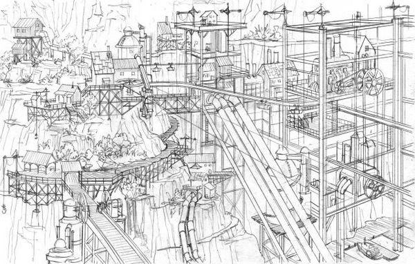
Being a regular and avid Kotaku reader, I just stumbled over a small article and video from the developers of the game Damnation. This shooter tries to set itself apart by focusing on strong vertical elements in the gameplay. The video you can find here on Kotaku explains their approach to level design which is different enough to be remarkable. Update: there’s a HD version of the video available on Gametrailers.

The “usual” approach (if there is such a thing) of Shooter 3d Level Design is to come up with a floorplan of the level. Then concepts of important areas, which might have existed before or are created after the floorplan, are integrated. For example the secret temple at the heart of the map will be placed in a wide open area at the focus point of the level. The advantages of this are that the Level Designers can clearly plan the gameflow but obviously this has a few drawbacks. For example it might result in environments that do not fit together as well visually as they could. I also believe that this approach might be responsible for the prevalence of Room/Corridor/Room Levels.
The workflow chosen by the Damnation Developers Blue Omega begins with a large scale concept of the level, which is then used by the level designers to plan the player’s possible paths. This propably requires a close cooperation between the Concept Art and Level Design departments. An advantage I can see though is that the levels might end up looking much more organic, since they were planned as a “visual whole” instead of as a sequence of events/areas.
While I wasn’t too keen on Damnation, this video made me curious to take a closer look at the levels to see the fruits of this technique. It certainly sounds like an interesting idea but I’m sure that it’s not a perfect new solutions. Like everything it’s a method that has it’s uses for certain games . But it’s another tool to put in your Level Designer Toolbelt.
